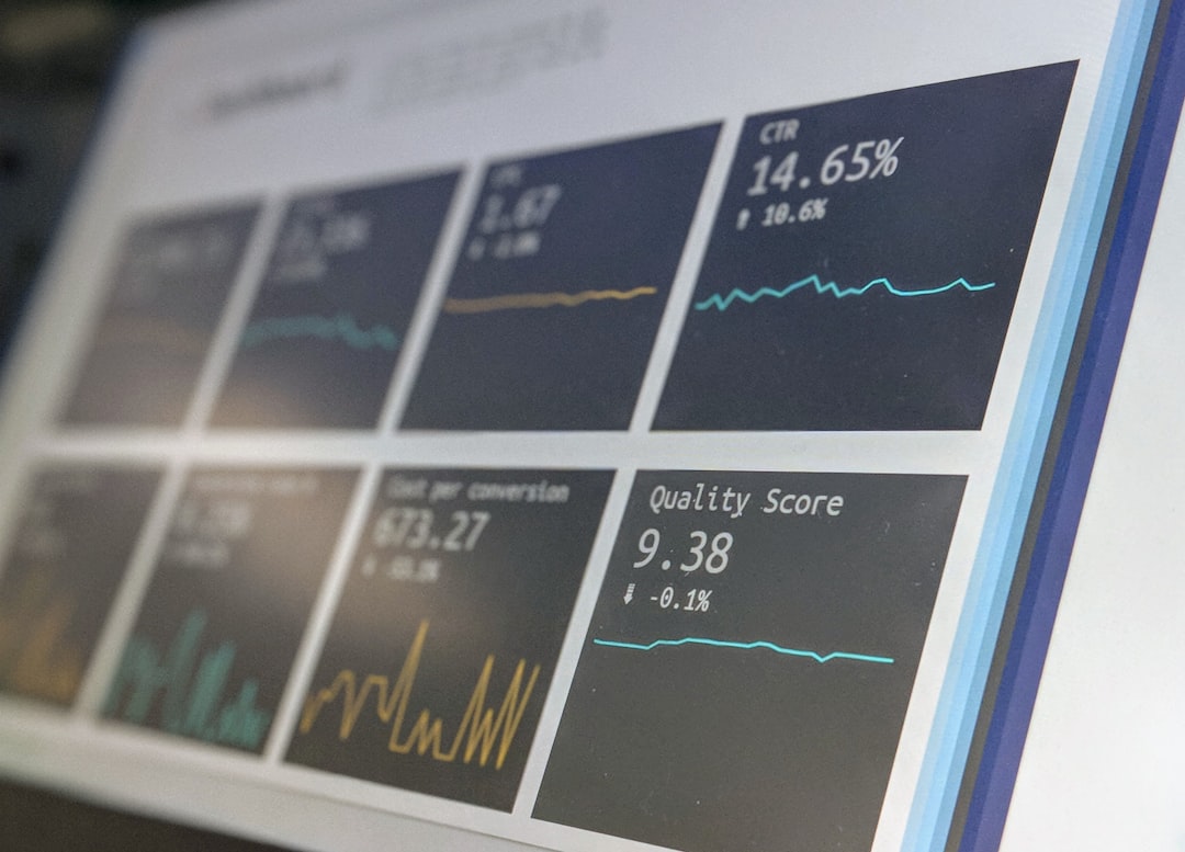
In the fast-paced world of startups, keeping an eye on the right metrics is crucial for success. A well-designed KPI dashboard can be your compass, guiding you through the complexities of growth and ensuring you’re on track. But with so many tools available, choosing the right one for your startup can be daunting. Let’s dive into a comparison of some of the top tools for creating startup KPI dashboards.
Understanding the Importance of KPI Dashboards
KPI dashboards are not just about pretty graphs and charts. They’re about clarity, focus, and data-driven decision-making. For startup founders, having a real-time view of critical metrics like customer acquisition cost, churn rate, and monthly recurring revenue can make the difference between scaling successfully and stalling.
Top Tools for Startup KPI Dashboards
Let’s explore some popular tools in the market, each offering unique features that cater to different needs.
1. Tableau
Tableau is renowned for its powerful data visualization capabilities. It’s an excellent choice for startups that need deep, custom analytics. The drag-and-drop interface allows users to build dashboards without needing extensive coding skills.
Pros: Intuitive interface, strong community support, and robust data integration capabilities.
Cons: Can be pricey for startups, and there’s a learning curve for advanced features.
Real-world example: A SaaS startup used Tableau to transform raw data from various sources into actionable insights, driving a 20% increase in customer retention.
2. Microsoft Power BI
Power BI is a great option for startups already using Microsoft’s ecosystem. It offers a seamless experience with other Microsoft products and provides a range of data connectors.
Pros: Cost-effective for Microsoft 365 users, easy integration with Excel, and strong AI capabilities.
Cons: Interface can be less intuitive for non-Microsoft users, and customization options are limited compared to Tableau.
Case study: A tech startup leveraged Power BI to unify their sales and marketing data, leading to a 15% increase in lead conversion rates.
3. Databox
Databox is designed for startups that need quick, easy-to-understand analytics. It’s particularly suitable for those who need to track KPIs across multiple platforms.
Pros: User-friendly setup, mobile app for on-the-go tracking, and a library of pre-built templates.
Cons: Limited customization and might not scale well with more complex data needs.
Example: A small e-commerce startup used Databox to monitor their social media metrics, which helped them optimize their campaigns and double their ROI.
4. Geckoboard
Geckoboard specializes in turning data into easy-to-read dashboards that can be shared across teams. It’s ideal for startups that want to maintain transparency and keep everyone aligned on goals.
Pros: Simple setup, real-time data updates, and excellent for team collaboration.
Cons: Limited advanced analytics features, and it might not suit startups with complex data needs.
Usage scenario: A digital marketing agency used Geckoboard to display real-time performance metrics in their office, fostering a data-driven culture.
Choosing the Right Tool for Your Startup
When picking a tool, consider your startup’s specific needs, budget, and the complexity of data. Do you need deep analytics or just a simple overview? Will your team be comfortable with the tool’s interface?
Additionally, think about scalability. As your startup grows, so will your data needs. Choosing a tool that can grow with you is essential.
Conclusion — Making the Decision
Selecting the right KPI dashboard tool requires careful consideration of your startup’s unique needs and goals. By assessing the strengths and limitations of each option, you can ensure that you choose a tool that not only fits your current requirements but also supports your future growth. Remember, the best tool is the one that empowers your team to make informed, data-driven decisions every day.
Photo by Austin Distel on Unsplash